


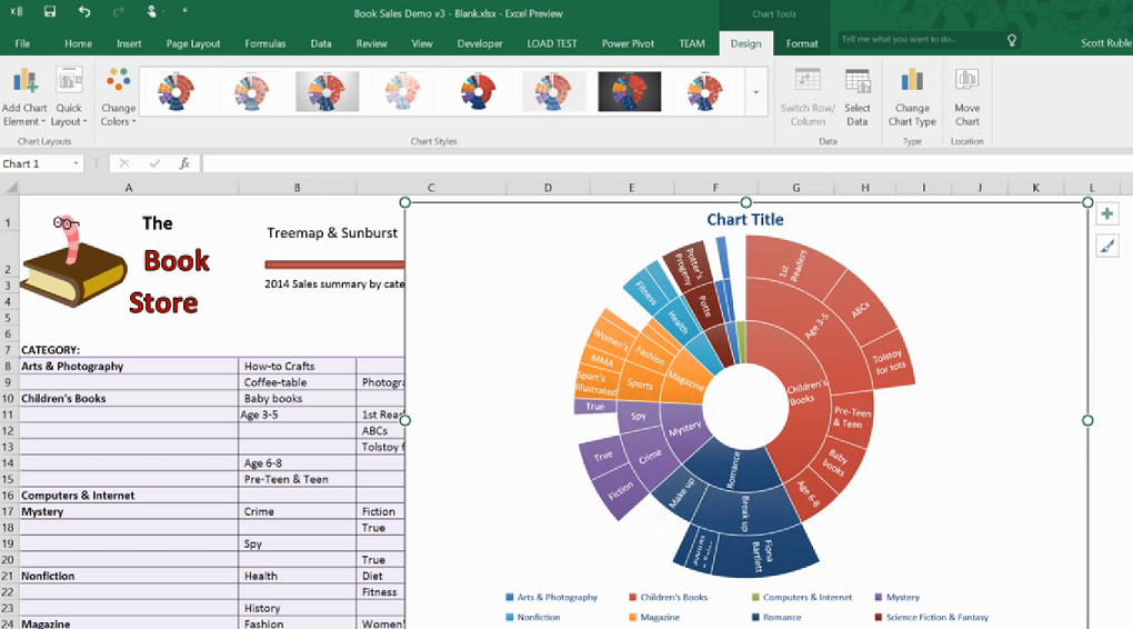
When you have a lot of data you need to visualize, you must seek the best charts options available. Microsoft Excel offers some of the best charts you can use to analyze data and extract insights. Even though there are multiple charting options, you need to find the best options available.
Sadly, getting the best charts in Excel is not easy since many people need help understanding how to choose charting types based on their data.
The reality is that Excel offers you a wide variety of charts to choose from during data visualization. If you are dealing with multiple data from different sources, it might be overwhelming to get the work done.
Before you choose your prefer chart type, you need to understand what needs to be track and everything that matters. Identify the best approach that you can use to visualize the data and extract all the insights that matter.
Given that many people struggle to visualize their data, this blog post offers a lasting solution that you can count on.
This article outlines some of the best charts in Excel and how you can use them to achieve your data visualization goals. Check them out!
Table of Contents
Bar Charts
Bar charts are some of the common Excel charts use by many people to visualize their data.
The chart is mainly use for comparison purposes. It can also be use to showcase percentages across different sets of data.
Note that bar charts are the simplest options to use when comparing different data elements that are closely related.
In addition, you don’t need to be a technical expert to compose a bar chart in Excel. As long as you have accurate data that you intend to convert into a bar chart.
The chart presents data clearly, making it easy to read and make conclusions.
If you are unsure when to add a bar chart to your data, take time and think about your objectives and what you intend to get as the final output.
Also, think about your personal preferences before making the final choice. If you have a wide range of data sets to compare to one another, create a bar chart and compare the values.
Line Chart
Do you have data trends and periods that you want to explain? The line chart can do exactly that. On a line chart, the vertical axis displays the numeric data amount while the X -axis shows other forms of related data figures.
When drawing a line chart in Excel, you can display them using markers shaped like circles or squares.
Even though line charts are a bit colorful when compared to other Excel charts, they are easy to read and understand. When using a line chart, it takes a short while for you to recognize the patterns and other forms of insights in your data.
In addition, you can use this charting type to compare trends in different data groups during data visualization.
Thus chart type is mostly used by business managers to measure and analyze the long-term trends in the number of sales recorded. The chart is also applied in financial data and when analyzing marketing statistics to evaluate the performance of a given business.
Scatter Charts
Scatter charts are the best for analyzing how different business goals revolve around the ultimate topic of discussion.
You can use a scatter chart to compare different types of products depending on the given budgets and the selling prices. A scatter chart contains different elements, such as points, markers, and straight lines.
All these elements work together to indicate and connect the separate data units available. When drawing a scatter chart in Excel, you can use either markers or lines. The markers are mostly used when processing small data points, while the lines are used when drawing large data points.
Note that scatter charts have similar characteristics to line charts since they all use vertical and horizontal axes. However, scatter charts have the ability to display the degree of difference from one variable to the next.
The chart can help you uncover correlations in your data and how different variables differ from one another.
Comparison Chart
When listing some of the advanced charts in Excel, you cannot miss mentioning the comparison chart. A comparison chart, also known as a cluster chart, is used to compare the difference between at least two data sets.
The chart offers a visual comparison format that is applied when comparing both qualitative and quantitative data.
Also, there are different types of comparison charts when comparing different types of days, such as correlations, time series and many others.
The ultimate goal of a comparison chart is to showcase and outline any possibilities that occur in different data sets. The charts are mostly used when dealing with research topics and decision-making.
Also, you can use a comparison chart when working on your science project or any subject within the education sector.
In developed organizations, the comparison chart is used to evaluate the progress of your business over the years. The chart aids business stakeholders in assessing different aspects when making prudent development decisions.
Pie Chart
A pie chart is one of the best Excel charts used to showcase a detailed breakdown of an individual data dimension.
This chart type takes the shape of a pie, contributing to its name, pie chart. The chart displays how different data categories are related to the whole thing. A pie chart is mostly used when dealing with categorized data.
Also, you can use this chart type if you want to display the difference among data categories that are closely related.
In addition, you can easily break down data categories to give you a better picture of how every bit contributes to the whole thing. When doing a business project, you can use a pie chart to analyze how specific factors are related.
When using a pie chart to analyze data, remember that the categories in the chart sum up to 100%. This means that when making data calculations on a pie chart, the sum of all the elements outlined on the chart should be at most the 100% mark.
Conclusion
Excel offers some of the best charts and graphs for data visualization. The tool has a successful record of helping data analysts extract critical insights from their data in their comfort zone.
Besides, the tool is easily accessible and easy to use. It’s user-friendly, and you can easily learn how to use it within the shortest time possible since it does not incorporate technical elements.
Regardless of the technicality of the data that you intend to visualize, Excel charts have your back covered. All these chart types operate in a simple way that you can easily navigate through within minutes, and you are good to go.
In addition, you don’t need to spend money hiring technical experts to help with your data visualization goals. Excel charts offer you everything you need!