


A professional logo design is one of the essential factors that you need to consider when building your brand. With a logo, you can describe who you are and what you stand for as a brand. It also influences the perception of your business in potential clientele who may see it.
Not only this but if a business goes through changes, those changes are also reflected in the logo. Apple makes a great example in this case. The tech giant wanted to change its brand personality from a friendly and approachable company to an innovation powerhouse, Apple went for a sleeker design.
Logos are also responsible for maintaining a brand’s image. And it’s incredibly important to contemplate different aspects, such as colours, fonts, or creative elements to design a compelling logo. But there are also the following things that you need to avoid while designing a logo.
Table of Contents
1) Uncertain Intention
Sense of intention is as important as font, image or other elements. Because the visual style you opt for gives your target audience a glimpse of your company’s values and purpose, establishing an emotional link to your product.
For example, you would want to develop a different emotional intention behind an airline logo than for an Italian restaurant. Remember, your target audience will likely connect your logo to your company’s essential purpose. That’s why a sense of intention needs to be there.
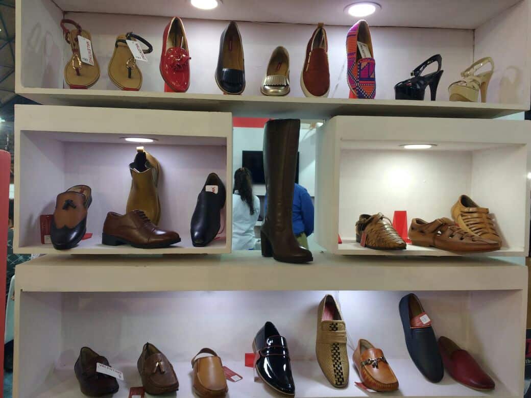
Conversely, if your company deals with fashion, you need to go for something bold and edgy, so it’ll resonate with your audience. And something calm and trustworthy will be perfect for a customer service
2) A Cluttered Design

You might feel tempted to showcase your creative skills while designing a logo, but it’s still better not to go overboard with the actual web design. A symbol carrying a mix of images or too much complexity can confuse people or worse undermine your brand’s purpose.
That’s why you need to aim for simplicity for the following reasons:
Versatility
A logo needs to be versatile, so you can reproduce it in different sizes for different mediums without losing its style or meaning.
Memorability
You want people to engage with your logo when they look at it. And when they think about your product, they’ll quickly recall your logo and brand name. That’s why you’re supposed to come up with a design that’s memorable.
Impact
With just one glance, your target audience should understand what your company is all about. Therefore, it needs to be an impactful symbol.
3) Using Raster Images
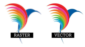
Raster graphics can limit reproduction. You need to opt for standard practice when designing a logo and use vector graphics software, such as Adobe Illustrator or Corel Draw. Because a vector graphic consists of mathematically precise points that ensure and maintain visual consistency across several sizes.
Raster graphic software, such as Adobe Photoshop consists of pixels. And it’s better to avoid using raster images as it leads to problems during the reproduction phase. Know that Photoshop is capable of creating extra-large logos, you never know how large you’ll need to reproduce your logo later.
It’ll look pixelated if you zoom it in enough on a raster graphic making it unusable. That’s why maintaining visual consistency is crucial to make your logo look the same in all sizes. Also, vector graphics for logo design UAE is also beneficial for:
- Logo editing if required in future.
- Scalability to any size maintaining its quality.
- Adaptability to other media easily.
4) Choosing the Wrong Font

The font you choose makes a greater impact on a logo. If you don’t focus on it, a poor font choice can ruin your logo. You can choose the perfect font for your design by matching it to the style of the icon.
However, you need to be careful as if the match gets too close, the icon and font will compete for attention. And if the match is opposite, then the audience will be confused over where to focus. Your job is to find the perfect balance.
Each typeface carries a personality. If the chosen font doesn’t reflect the icon’s characteristics, the whole message of your brand will be at risk. The reason why fonts create problems is that designers don’t consider them important enough.
You can refer to professional font foundries, such as MyFonts for better typeface options than those over-used websites offering for free.
5) Using Too Many Colors
You can’t afford to ignore colour psychology while designing your logo. Because colours have meanings and emotions attached to them. You can even use colours to send a message about your brand. No matter how much you like shades of purple, you can’t apply them to your logo.
Moreover, colours have their own psychology. For example, blue colour depicts serenity and sophistication, red signifies passion, whereas black doesn’t suit a cheerful or fun idea.
When it comes to colour combinations, know that you need to limit it to three at max, such as black, white and a third colour that garners attention. Using too many colours will make your logo look messy while incorporating two or three colours will keep your design clean and crisp.
6) Incorrect Element Placement
Although it’s considered a post-design mistake, you can steer clear of it if you focus beforehand. You want your logo on everything that’s associated with your business venture.
Be it your website’s homepage or printed merchandise, you want to place your logo everywhere. But people often deal with this factor carelessly without thinking about what it’s going to look like, which is a major mistake.
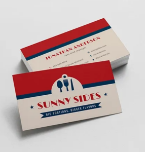
For instance, keeping your professional logo in the centre of a webpage looks awkward. Similarly, a professional logo shouldn’t take up the whole width of your business card. If you must keep your logo on the website, place it in the top-left corner.
And don’t forget to picture it at different places in various positions, sizes and layouts before deciding its placement, while you’re working on branding.
Wrap Up
Designing a professional logo won’t happen overnight. Since it’s an extensive process, you’ll need time to research, brainstorm, and experiment with different colours and styles and so on. Whatever approach you may choose, ensure that it reflects your brand accurately. A logo is a powerful tool when it comes to establishing your place in the industry or capturing the target audience’s attention, so use your tool wisely.