


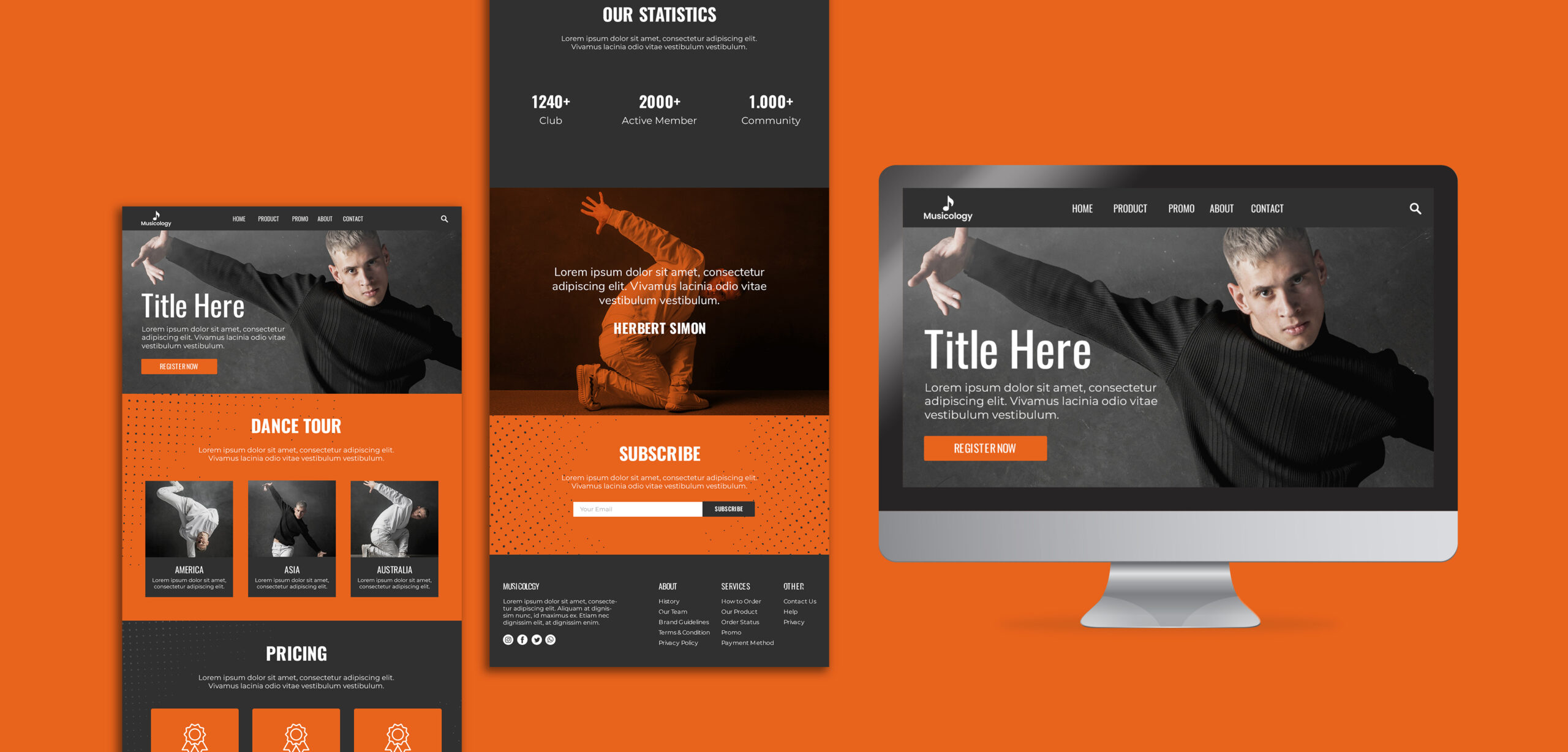
The design of the website’s navigation has the greatest impact on usability. Visitors will leave your page and go for a more user-friendly option if they can’t figure out what to do when they arrive.
Well, don’t believe us, but so says the website design company. Instead, visitors who can easily locate what they want and need thanks to clear, simple navigation are more likely to convert.
Navigation has a prominent impact on your end users. While all the websites have menus, some are far superior to others. And page navigation is the game changer. The navigation’s layout and labelling can significantly impact your end goals.
The secret to success in digital marketing, as brought about by branding agencies, is unquestionably your website’s navigation bar. It’s one of your website’s most crucial components because it has an impact on the most crucial results:
- Traffic is impacted by navigation via search results.
- Conversion rates and attractiveness of the navigation have an impact on lead generation.
- If the first two variables weren’t enough, your website’s navigation has an impact on almost all of the other success elements as well:
- Brand perception is impacted by navigation. Those labels indicate where you are.
- Website upgrades are impacted by navigation. Some menu designs are more difficult to update.
- Accessibility is impacted by navigation. For users with disabilities, some menus present greater challenges.
- As per the creative agency, even analytics is impacted by navigation. Measuring user flows might be challenging due to the navigational layout.
Now that we know the importance of page navigation, it is crucial to see how you can achieve it.
Table of Contents
What are the Best Website Design Practices for Page Navigation?
It’s crucial to realise that developing navigation only happens after creating a defined information architecture (IA). I will lay a strong basis for your navigation system; all left to do is improve usability.
The following advice emphasises the need to create predictable and recognizable navigation. They may be used for both–website as well as app navigation.
On-the-face: Keep the Navigation Visible
The elements that visitors value the most should always be prominently displayed in your website navigation design. This principle applies to both the navigational options and the content. Some designers utilise patterns like the hamburger menu, which by default conceals navigation, which should be avoided at all costs.
Information architecture allows you to consider user expectations for the content while designing a sitemap. To construct a hierarchy consistent with user expectations, you can distribute both the pages and the information on the pages. The same guidelines apply to other design choices, such as where to position distinct items like the menu on the page. It should be possible for users to anticipate where they will find navigation. Put the navigation in the page’s header, sidebar, and footer, which are the most expected locations.
Draw a Clear Line of Context Between Content and Design
A navigation section shouldn’t have the same design as the website’s other modules, such as content. It should be noticeable. Whitespace (negative space) can be used to divide material visually. Try to avoid confusing the users with the clutter. For header navigation, some websites employ buttons. This may increase the layout’s visual clutter and give the page a hefty appearance. It’s advised only to utilize buttons to indicate calls to action (Begin Now, Get Started, Contact Us, etc.). But by doing that, you will get the best results with your call to action button.
Create Labels with Clear Details
Any navigation design for a website should be foreseeable. Before interacting with any choice, the user should be able to realize its purpose. As per the website design services providers, visitors to your website will benefit from descriptive labels in the navigation since they quickly give away the true meaning of the labels. Search engines can benefit from understanding the purpose of your website with the help of descriptive labels.
Avoid labels like “Articles” or “Videos,” which are too general. Since these types of labels only describe the content’s format rather than the subject, such labels are not descriptive. People typically don’t care about how the information is provided when they visit websites to find the answers to their issues. Therefore, utilizing language pertinent to your intended audience’s objectives is preferable.
Watch the sequence
The sequence in which the objects are presented is just as important as their total amount. When creating a website’s navigation, you could arrange the options according to importance, starting with the most priority option and working your way down. Although it’s a good strategy, it’s also crucial to consider the Serial-position impact. This effect states that they are more effective as our brains remember the information at the beginning and end more readily than the items in the middle. Therefore, the options we place at the start or end of our route become more noticeable. In addition to this, you should display a link to the product page when designing the website navigation for a product.
The homepage isn’t the Only Priority while Designing your Website’s Page Navigation
One common mistake that product designers frequently make is thinking that perhaps the homepage is where users begin their journey. Since many users arrive at a website straight through search engine results, links from social media, and other websites, the homepage might not serve as the primary entry point for many of them. As a result, you must pay close attention to the website’s navigation and make absolutely sure it is clear on each page.
You must decide who your target end user is and create a navigational structure that meets their needs in order to drive them deep into the sales funnel. You can simply opt for tools such as Google Analytics to determine the areas of your website that are most frequently visited and make sure the navigation on those pages is simple to use and effective.
Test the Responsiveness of your Website’s Page Navigation
Mobile devices are used by 3.7 billion individuals to access the internet. If your website’s page navigation doesn’t display correctly on mobile, all the efforts that you put into the website design can go to waste. Make sure the navigation on your website is completely mobile-friendly. On a mobile device, navigation instructions should be simple to read. For the majority of situations, a reasonable default font size in CSS is 16px. The size of the navigation buttons should allow for simple tapping. For the majority of user groups, a touch target with a magnitude of roughly 9mm works well.
What’s Next? Check Out how your Users Engage with your website’s Navigation Page
After making adjustments to your website, the process of designing the website navigation doesn’t finish. It’s also critical to check that visitors can use your menu to browse effectively. Because of this, you should take the time to research how your visitors are using your website. With the help of instruments like tree testing, you can rely on Statistics to monitor visitor behaviour.
Look at the “Behavior Flow” view in the Google Analytics Behavior report. The dropoff percentage will be displayed in red boxes adjacent to each of your menu items in Google Analytics. This report will give you suggestions for how to improve the typical navigational flows that visitors to your website take. Ultimately, it’s important to take feedback from the flow of your users and revamp the navigation page of your website accordingly.
Author Bio:
Brijesh Jakharia co-founded SPINX Digital in 2005 and takes great pride in crafting web and mobile marketing solutions for mid-market businesses to enterprises. Marketing is his passion, and the thrill to build a brand from the ground up has helped him craft successful brand stories for world-class clients. While not at work, he loves to spend his time on research and reading digital content stories.
Also Read: What Are The Cheapest SMM Panels In The World Today.


Alyson Aiden
November 22, 2022Nyc article is wonderfull Content same niche animated video production agency what iam looking Service